
Google Mobile-First Indexing: Everything You Need to Know to Rank Well
With a big catalog of 234+ extensions for your online store
Tables of contents
- What is Mobile-First Indexing, Anyway?
- 1. Verify with Google Search Console
- 2. Ensure Mobile-Friendliness
- 3. Use Responsive Design
- 4. Optimize Metadata
- Final Thoughts
Back in the day, website owners only concerned themselves with how their websites displayed on desktops.
But as technology advanced (and continues to do so), site owners found themselves having to cater to an entirely new set of site visitors — those on mobile devices.
With mobile devices like laptops, tablets, and smartphones now account for nearly half of the world’s internet traffic, it’s more important than ever for website owners to optimize their sites for mobile-friendly experiences.
After all, you don’t want to miss out on opportunities to generate leads and secure sales because your website doesn’t display nicely on a mobile device.
But more than that, your website needs to be mobile-friendly for Google’s mobile-first indexing so you can continue to rank well in search results.
What is Mobile-First Indexing, Anyway?
Mobile-first indexing means that Google looks at all mobile websites first when indexing and ranking content for search results.
Since most people using Google do so on their mobile devices, Google implemented this ranking factor to encourage site owners to prioritize mobile-friendliness and give their site visitors seamless user experience.
After all, Google is really all about that user experience.
If you want to make sure your website continues to rank well in search results while providing site visitors an easy way to access your site on-the-go, check out these top ways to optimize your site for mobile-first indexing.
1. Verify with Google Search Console
Google Search Console is a free service offered by Google to help you monitor and troubleshoot your website’s presence in Google search results.
While you don’t have to use Google Search Console to rank in search results, the data provided helps you understand how Google sees your website so you can make improvements.
It’s an absolute must-have for website owners who want to dominate their niche, especially considering how competitive SEO has become in every industry imaginable.
Benefits of Using the Google Search Console
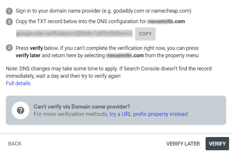
To verify your website or property on Google Search Console, enter the domain address or URLs you wish to track and click “Continue.”
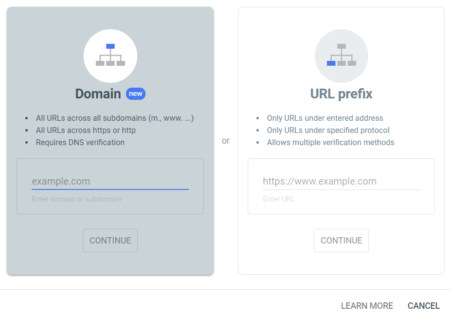
The next step is to copy a line of text into the DNS configuration of your property. This particular file can be accessed from your hosting account’s control panel.
Verifying your website with Google Search Console will give you access to information such as:
- Whether Google can find, crawl, and index your website
- Indexing problems so you can fix them and submit them for re-indexing
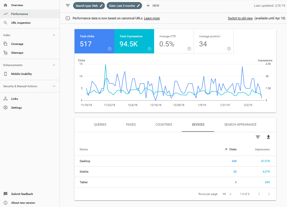
- Google Search traffic data like how often your site appears in results, which queries show your site, and how often people click through for those queries
- Spam and hacking issues plaguing your website
- Which external websites are linking to your website
Using the Mobile Usability Checker
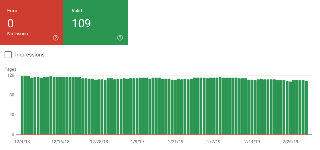
The Google Search Console also automatically monitors your website for any issues experienced by mobile users.
Start first by adding your website as a property on Search Console. When ready, simply click “Mobile Usability” under the “Enhancements” section of your dashboard.
Right off the bat, you should see a timeline with all pages that have mobile usability issues as well as those that performed normally during user sessions.
What you won’t get with the Mobile Usability checker, however, is a comprehensive checklist of steps you need to take in order to improve the mobile experience on those pages.
This is where the Google Mobile-Friendly Test steps in and takes over.
2. Ensure Mobile-Friendliness
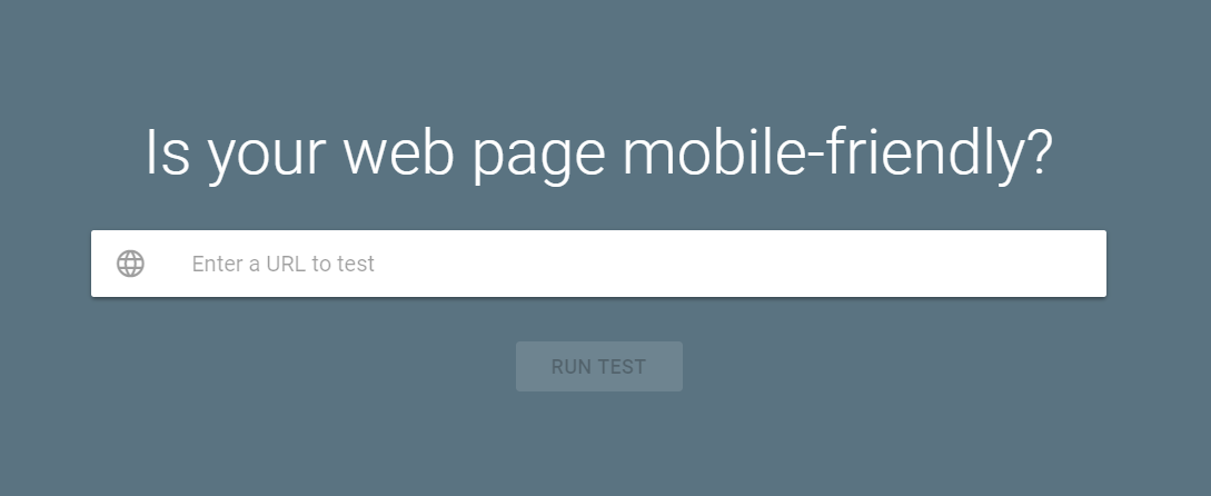
The quickest way to determine whether your website is ready for mobile-first indexing is to test it using Google’s Mobile-Friendly Test.
This free tool will tell you right away whether your website is mobile-friendly or not. All you need to do is enter your website’s URL and click “Run Test.”
Those are the only two interactive elements on the site, so you can’t miss them!
It shouldn’t take the Mobile-Friendly Test long to completely analyze your page for any issues on your page’s mobile usability. But, in order to showcase the full scope of the tool’s analysis, let’s run a test on The World’s Worst Website Ever.
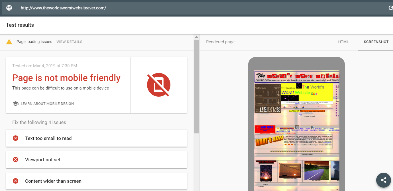
For the sake of this guide, let’s briefly discuss the reasons why TWWWE didn’t pass Google’s Mobile-Friendly Test. You’d do well to avoid similar issues in your website.
Text Too Small
When optimizing your website’s mobile usability, a golden rule is to avoid using small fonts that may be illegible when rendered in smaller mobile screens. It’s also helpful to utilize white space to maximize the readability of your content.
Viewport Not Set
In simple terms, the viewport is a meta tag that controls the scaling and dimensions of a page. When the Mobile-Friendly Test states that you haven’t set the viewport meta tag on your website, it simply means that the meta tag is missing — leaving web browsers without instructions on how to render the page.
Content Wide than Screen
Although wide content can be comfortably viewed on a desktop device, the same can’t be said on mobile devices. Sure, users can probably enable “landscape mode” to view wide content properly, but it still impedes the user experience.
Clickable Elements Too Close Together
Lastly, remember that mobile users don’t normally use precision human interface devices like keyboards and external mice. To make sure their experience runs smoothly using only their fingers, clickable elements — from buttons to forms — must have ample spacing between them.
In addition to a list of problems that you need to address in order to improve mobile usability, Mobile-Friendly Test will also help you find the resources for the necessary optimizations.
By clicking “Learn how to fix these errors.” the tool will redirect you to a complete list of issues with links to more actionable guides.
3. Use Responsive Design
Google themselves confirm that using responsive design is one of the best ways to instantly optimize your search rankings.
With responsive design, you are serving the same content to both desktop and mobile users, so there’s never a discrepancy between content.
In other words, you’re telling Google that nothing has changed and to continue ranking as usual.
The great thing about using responsive design on your website is that no matter what type of device accesses your website, your site’s content will display the right way.
That’s because responsive design adapts to the screen size accessing the website, so it never requires users to excessively scroll, zoom, or pinch to see the content.
And since Google is all about the user experience, this is a great way to boost your rankings.
That said, there’s more to responsive design than using a responsive theme or template on your site and hoping for the best when people visit your site on a mobile device.
Here are some additional web design best practices to follow:
- Avoid using mobile popups because they make it hard to navigate your site and can be tough to get rid of on small screens
- Don’t use Flash, especially since Apple phones won’t allow users to view Flash elements
- Make your call to action button large enough that people on small devices can easily click it
- Don’t use too many images as they crowd the screen real estate on mobile sites and distract users from your value proposition
Using responsive design on your website puts you on the right track to surviving mobile-first indexing.
However, with a few design tweaks, you can push ahead of everyone else and start ranking higher than ever, while still giving mobile users a great experience.
Using the Responsive Checker Tool
As you implement mobile responsiveness on your website, regular testing is essential to make sure everything displays as you intended.
However, testing responsive websites can be incredibly time-consuming and stressful.
The main issue is the fact that mobile devices use different resolutions and screen layouts.
For example, if you only tested your website on a smartphone with a 1080p display, it may not render properly for users with an iPhone XR, which has a 1,792x828 (828p) screen resolution.
The good news is, you don’t have to perform tests on every single device out there. To make sure people can navigate your mobile site the way you want them to, you can use the more intensive Responsive Checker tool.
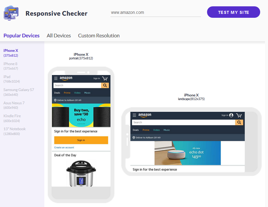
With this tool, you can instantly view how your website looks on multiple device types including laptops, tablets, and mobile phones — thus, eliminating the problem of having too many devices to optimize for. You can change the model in an instant by clicking the appropriate device name on the left sidebar.
The best part about using Responsive Checker is that you can navigate your website’s pages to make sure that more than just your homepage display properly.
Doing this will give you a real-time look at how users view your website from their mobile devices.
It will also help you identify any web design or functionality issues that you didn’t know about.
4. Optimize Metadata
When it comes to mobile-first indexing, your site’s metadata is vital.
Not only does this information tell people performing Google searches what your content is all about, it tells crawlers how to index and rank your website.
The essential metadata to optimize on your website include keyword optimized page titles, meta descriptions, and image attributes.
You should also add your target keywords into your blog content, landing pages, or product pages to make sure your content appears for the right audience in search results.
To find keywords for your site’s content, use a tool like SEMRush.
With this tool, you’ll see information about your keywords such as:
- Organic and paid search volume
- Average cost per click
- Keyword alternatives
- Websites already ranking for that keyword
- Advertisements using that keyword
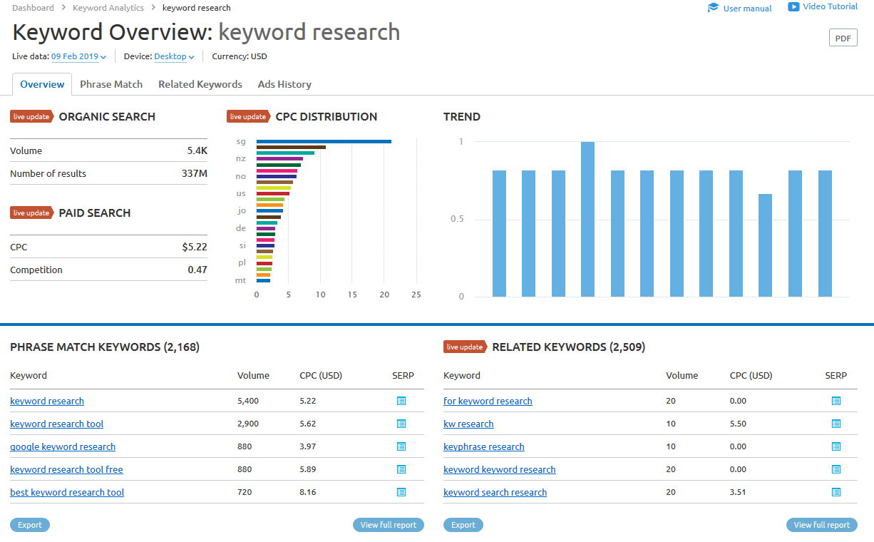
Once you’ve narrowed down the right keywords for your website, you’ll know which words to add to your content.
Here’s an example of a well-written content title and meta description as it appears in a Google search result:
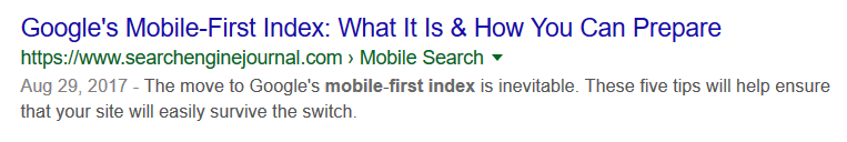
Notice the use of the keyword “mobile-first index” in both the content title and meta descriptions.
One other thing to notice that will play a role in how well you rank in search results is the site’s domain name.
The topic this site is trying to rank for involves search engines, Google, and mobile-first indexing.
And it just so happens that when they decided to buy a domain name for their website, they included the keyword “search engine” in it.
This domain name signals to Google’s crawlers that their site is about search engines and that they should rank it accordingly.
More importantly, it helps users identify out of millions of search results that this website is a credible source of information about topics related to search engines, such as mobile-first indexing.
Everything people see in search results, such as content titles, keywords, meta descriptions, and even domain names play a role in how you’ll rank, especially on mobile devices.
So start by performing your keyword research.
From there, craft compelling titles and descriptions, and make sure the snippets are the same on all versions of your site to improve your SEO efforts.
Final Thoughts
Gearing up for Google’s mobile-first indexing isn’t hard if you understand why it’s being done and what you can do to optimize your site to get the best search rankings.
After all, you should want to give your users a great experience when they visit your site, no matter what kind of device they come from.
And preparing for mobile-first indexing helps you do just that.
If you want to ensure your users are always able to view and navigate your site with ease, no matter the device, follow the above-mentioned tips and tricks for optimizing your website for mobile-first indexing.
& Maintenance Services
Make sure your M2 store is not only in good shape but also thriving with a professional team yet at an affordable price.
Get Started
New Posts


May 2023

Stay in the know
Get special offers on the latest news from Mageplaza.
Earn $10 in reward now!


